Paper, Card, or Fabric for a Cut-Paper Study?
Choose paper, card, or fabric for a cut-paper study by matching the material to the edges, layers, and handling your composition needs.
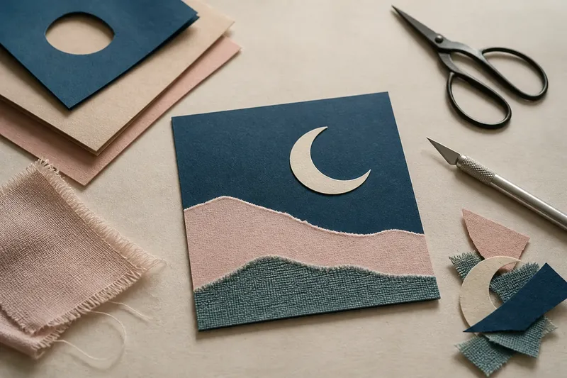
Paper, card, or fabric can give the same cut-paper study three different kinds of edges, and the best choice depends on what you want those edges to do. For a small cut-paper composition, begin by deciding whether you need crisp shapes, firm layers, or soft, irregular boundaries.
That decision matters more than the material’s label. A thin sheet may fold into a delicate ridge; a stiff card can hold a clean silhouette; woven fabric may fray into a lively fringe. None is automatically better. Each changes how a shape separates from its background and how it behaves when you move it.
Paper, Card, or Fabric?
Choose paper for fine cuts and easy repositioning, card for shapes that should stay flat and distinct, and fabric for edges whose softness or weave should remain visible. These are starting points, not rules: paper weights vary, card can bend, and tightly woven fabric behaves differently from loose cloth.
For a compact study, ask what the composition needs from its material. If its subject depends on narrow curls, pointed corners, or small openings, paper is usually the least cumbersome. If broad pieces overlap and must retain their outlines, card offers more body. If the image calls for a torn, tactile boundary, fabric can make that quality part of the design.
It helps to separate two questions: What should the cut edge look like, and what should happen when the piece is handled? Those answers may point to different materials. You might cut a precise silhouette from card, for instance, while using a small fabric fragment as an intentionally loose accent.
What Do Edges Reveal?
Paper tends to give a direct blade a neat edge, especially on simple curves and clean corners. Very thin paper can buckle or wrinkle if it is pushed around after cutting, while a fibrous sheet may leave a slightly feathered boundary. That variation can suit a soft subject, but it may distract from a shape that depends on exact geometry.
Card holds broad outlines more firmly. Its thickness makes the cut line visible from an angle, which can add a slight shadow where one shape meets another. That shadow may help a layered composition read clearly; it can also make a tiny notch look heavier than intended. For small, intricate forms, a modestly firm card is easier to manage than a very dense, resistant board.
Fabric brings the weave into the edge. A close weave can make a smooth, controlled contour, while a loose weave may shed threads or distort at a narrow point. A raw edge is not a flaw if its loose texture is part of the image, but it can make delicate shapes difficult to keep legible.
Imagine you are making a small study of a crescent moon over a block of color. If you cut the crescent from thin paper, its narrow tips may curl as you shift it; cut from card, they are more likely to hold their shape, though the edge may cast a stronger line. A fabric crescent would soften the silhouette and expose its weave. The useful choice is the one that supports the mood you want, not the one that produces the most exact cut.
How Do Layers Behave?
Thin paper makes it easy to stack several shapes without turning the composition into a bulky pile. Light can pass through some papers, making a lower color show faintly beneath an upper layer. That can enrich a flat arrangement, though transparency may muddy a color you hoped would remain solid.
Card creates more separation. Overlapping pieces can feel like distinct planes, and their edges are easy to see. If every piece is thick, however, the stack may begin to feel rigid or top-heavy. One way to keep the image from becoming visually crowded is to reserve card for a few prominent shapes and use thinner material for smaller accents.
Fabric layers bend and settle rather than staying perfectly planar. Their surfaces can soften the transition between shapes, and a folded edge can create a small ridge. The same softness may allow a lower piece to peek out unevenly. That behavior can add texture, but it is less suited to a composition that depends on uniformly flat, sharp boundaries.
Think about the meeting points, not only the colors. A crisp card shape over thin paper may create a clear visual hierarchy; two translucent papers may blend into a third color; fabric over card may contrast a soft edge with a firm one. These pairings can be more expressive than using one material throughout, provided the differences feel intentional rather than accidental.
Which Tools Suit Each?
For paper, a sharp craft knife and a self-healing cutting mat are useful for straight lines and controlled curves. Small scissors are often easier for larger freehand shapes. A metal ruler helps guide straight cuts, but keep fingers clear of the blade’s path and follow the tool maker’s instructions.
Card may call for a fresh blade and a patient pass rather than force. Pressing hard can crush the edge or pull a small piece out of place. For simple silhouettes, scissors may be the more comfortable option; for interior corners or narrow openings, a knife gives more control. Choose tools suited to the card’s thickness and your level of experience.
Fabric is often easier to cut with sharp fabric scissors than with a general-purpose craft blade. Keep those scissors for cloth if possible, since cutting paper can dull them. A rotary cutter can make smooth lines on fabric, but it is sharp and needs a stable mat and careful handling. Avoid trying to force woven cloth into tiny intricate shapes that its threads cannot hold.
If the composition will be mounted, consider the adhesive as part of the material choice. A glue stick can wrinkle thin paper if applied heavily; a small amount of suitable PVA may work for sturdier paper or card; fabric may need an adhesive intended for textiles. Check the product label and material-maker instructions for compatibility. It is not worth seeking a specialized tool for every tiny cut: a good blade or scissors, a cutting surface, and a ruler cover many small studies.
How Can You Compare Samples?
Make a small, low-pressure comparison before settling on a full composition. Cut the same simple shape from paper, card, and fabric, then move each piece against the same background. Look at the edge from directly above and from a slight angle. Notice whether the contour stays clear, whether the piece bends, and whether its texture competes with the image.
Try a second shape that tests the weakness you noticed: a narrow tip for paper, a small curve for card, or a tight notch for fabric. You are not trying to prove which material is best in general. You are checking whether the material suits this particular shape and the kind of handling you expect.
- Cut a broad curve and see whether it stays smooth when moved.
- Cut a narrow point and check whether it bends, crushes, or frays.
- Stack two colors and look for unwanted shadows or show-through.
- Lift and replace a piece to see whether its edge changes.
- View the arrangement from above and from a shallow angle to compare its depth.
Keep the samples beside the composition rather than relying on memory. A material can look appealing in a sheet and behave differently once cut into a small form. If one sample has a useful edge but awkward handling, try using it only for a larger shape instead of rejecting it altogether.
Which Material Fits Your Aim?
Which material makes the cleanest small shapes?
Paper is usually the easiest place to begin when the design has fine curves or small openings. A firm paper can hold its outline better than very thin stock, while card can be preferable for a larger silhouette that must stay flat.
Can card work for delicate details?
It can, if the card is not too dense and the details are not so narrow that its thickness overwhelms them. For tiny notches or curling tips, use thinner paper or simplify the shape so the card’s edge does not dominate.
Will fabric stay flat in a composition?
Fabric can lie fairly flat when its weave is stable and the pieces are broad, but a raw edge may relax or fray as it is moved. If a crisp, unchanged boundary matters, paper or card is usually easier to handle.
Can I combine all three?
Yes, and contrast can make the materials easier to read: card can anchor a shape, paper can add a light layer, and fabric can introduce a softer accent. Keep the differences purposeful, and check that the chosen adhesive suits each surface.
What Should You Choose?
Let the composition’s most demanding edge guide the decision. If a small contour must stay delicate, begin with paper. If a broad form should hold its line and lift slightly from the background, consider card. If texture, weave, or a soft boundary is central to the image, try fabric.
For a useful first comparison, cut the same uncomplicated shape from each material and place the pieces over the same background. The test is modest but revealing: you can see which edge stays readable, which layer feels too heavy, and which surface gives the image a quality you want to keep. That is a more reliable guide to choosing paper, card, or fabric for a cut-paper study than the material name alone.